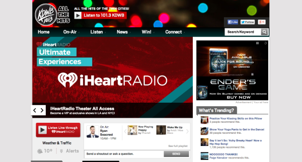
Since working with CPR for the past year and a half I’ve browsed through many radio station websites and what I cannot understand, to this day is – why are they so busy? Why can’t I figure out what I should be looking at when I’m looking for an image or a video for Paige’s daily newsletters?
Of course being a Designer, it makes me cringe, and it seems that I’m not alone. Mark Ramsey wrote a blog post on Things I hate about Radio Station Websites where he lists 21 reasons for the obvious – his hate for station websites!
In design school we learn less is more. We learn about “white space” or “negative space” and “above the fold.” “Above the fold” isn’t solely a newspaper term. In web design we use “above the fold” along with “above the scroll,” to refer to the portion of the webpage that is visible without scrolling.

It’s the most valuable real estate of a website and everybody wants that prime spot. With many screen sizes varying drastically these days (phones, tablets, laptops, desktops, windscreens, etc.) it is getting trickier to determine what content will go above the fold, but we must remember the value of white space. White space (negative space) helps define the content that resides in the positive space.
A page with too little white space makes visitors feel uncomfortable as cluttered pages are hard to read. Visitors quickly get overwhelmed and move on to a more welcoming site. On the other hand pages with too much white space can feel bare, as if there’s not enough content to fill the page.
Properly used, white space is essential for information architecture. It helps frame content, allowing users to find information quickly by working with the page layout and by subtly highlighting the most important information. It is imperative in web-designing and is an essential contributor to user experience.
Here are a few examples of radio station websites that make great use of white space:


Don’t think of white space as Dead Air, but rather a major structural player in your site’s layout. It creates harmony, visual comfort and legibility. All are fundamental components for a successful website!
I’d love to hear from you. Please share your thoughts and examples of elegantly used white space in radio web design by commenting below.
Image credits
- above the fold by Electric Puffin
Guest Post by Isabel Boschi
![]() Isabel Boschi is the founder and creative director of Nook Design Studio – a multi faceted design studio specializing in branding for small businesses. We provide a variety of services from print to digital and web media, while our design sense is contemporary and fun.
Isabel Boschi is the founder and creative director of Nook Design Studio – a multi faceted design studio specializing in branding for small businesses. We provide a variety of services from print to digital and web media, while our design sense is contemporary and fun.


 Last Tweets